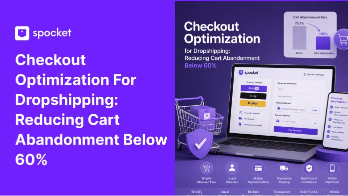
Checkout Optimization for Dropshipping: How to Reduce Cart Abandonment Below 60%?
Learn how to do checkout optimization for dropshipping stores. Reduce cart abandonment below 60% and keep more customers through to purchase.

You got those clicks. The product page served its purpose. There's a cart icon with products inside. Yet as soon as they get to the checkout page, poof! They vanished. On average, 7 out of every 10 customers who put an item in their carts abandon the site, resulting in a cart abandonment rate of about 70%!.
This is the place where all that effort to earn trust will be put to the test. If there's even a hint of doubt in them, the customer will not convert. And yet most dropship owners focus their efforts entirely on advertising campaigns and optimizing product pages but completely neglect the checkout process. This is the wrong approach because a little improvement here results in much higher profit than the same improvement made on the initial stages of customer journey due to the fact that traffic was already purchased.
What Is Dropshipping Checkout Optimization?
.webp)
Checkout optimization for dropshipping means methodically improving every step between the cart page and the order confirmation so more visitors complete their purchase. It's not a redesign. It's a series of small, tested changes to the checkout process that remove doubt, reduce effort, and keep the buyer moving forward. When you optimize checkout pages properly, you're not guessing. You're removing the specific friction points that cause people to abandon their abandoned carts.
The ecommerce checkout flow in a dropshipping store has unique challenges. Customers might hesitate because of shipping times, unfamiliar return policies, or concerns about product quality. An optimized checkout for dropshipping addresses these fears directly on the page, rather than hoping the buyer trusts you enough to push through. The goal of any checkout process optimization is simple: make the path from cart to confirmation so smooth that the buyer never has a reason to stop and second-guess.
Why Your Cart Checkout Is Leaking Sales?
Most checkout problems fall into a handful of categories. Confusion about what's coming next. Anxiety about hidden costs or security. Friction from too many fields or weird formatting. A lack of value reinforcement. Too many competing choices that slow down the decision.
Fix these and you plug the leaks. You don't need a complete redesign. Usually 10 to 30 small tweaks do the job. The key is knowing which ones matter most for your store.
For a broader look at fixing the pre-checkout journey, our guide on shopping cart abandonment strategies covers the full funnel. But right now we're deep in the checkout itself.
What Is Abandoned Cart Recovery?
Abandoned cart recovery is the process of bringing back shoppers who left your checkout e-commerce flow without buying. It usually takes the form of an abandoned cart email sent shortly after they leave. A good abandoned cart email reminds them what they left behind, shows social proof, and often includes a small nudge like free shipping or a modest discount. When set up correctly, abandoned cart automation recaptures 5% to 15% of lost orders without any additional ad spend.
The best abandoned cart emails don't feel desperate. They feel helpful. A first email within an hour simply says "you forgot something." A second around 24 hours later adds a testimonial. A third at 48 hours might include a small incentive.
Many stores also use a browse abandonment email for people who viewed a product but never added it to cart. Each message in this abandoned carts email sequence is a second chance at a sale that would otherwise be gone forever.
Best Checkout Optimization Strategies for Dropshipping Businesses
.webp)
Not all fixes are equal. Some changes produce outsized results because they address the exact moment where doubt creeps in. Others fix small annoyances that, combined, make the customer checkout experience feel broken. Here are 10 that actually move the needle.
1. Focus on Friction, Not the Number of Steps
A lot of store owners obsess over one-page versus multi-step. The data doesn't care. A three-step checkout beats a one-page checkout if each step is easier. What matters is what you ask and how you ask it.
A single page with 15 fields and no clear checkout flow is worse than three pages with five fields each. Audit every field. Does this need to be required? Can it be optional? Can it be pre-filled? That's where the gains live.
2. Hide the Coupon Field Behind a Link
Empty form fields grab attention. When a coupon field sits there empty, people feel like they're overpaying. They leave to hunt for a discount code. Some never come back. A simple fix: collapse the coupon field behind a text link that says "Have a promo code?"
Only people who actually have one will click it. Everyone else moves on without the nagging feeling they're missing out. This is one of those checkout UX tweaks that costs nothing and instantly lowers abandonment.
3. Explain Why You Need That Phone Number
Requiring a phone number without saying why freaks people out. They assume you'll call them or sell their number. If the only reason you need it is for shipping issues, say so. A tiny line under the field that says "For delivery questions only" is enough to calm most people.
If you don't actually use the phone number, make it optional. A lot of checkout page optimization comes down to removing doubt at the exact moment it appears.
4. Prefill Everything the Customer Already Told You
If someone typed their name at the shipping step, don't ask for it again at the payment step. Prefill the cardholder name. If they used a shipping calculator, prefill the zip code.
For B2C stores, the billing address usually matches shipping. Default it to same and only show billing fields if they uncheck a box. This is a fundamental ecommerce checkout best practice that makes the checkout user experience feel smart instead of repetitive.
5. Put Labels Above Fields, Not Inside Them
Inline labels look clean but cause problems. Once you start typing, the label disappears. If you tab out and forget what the field was for, you have to delete everything to see it again. On errors, it's even worse.
Always place the label above the field. It stays visible and avoids confusion. This applies across the entire checkout flow design and is still ignored by half the stores out there.
6. Make Guest Checkout Impossible to Miss
Forcing account creation is the fastest way to lose a sale. But even if you offer guest checkout, hiding it behind a wall of sign-in fields still kills conversions.
Put the guest option top left, make it prominent, and reduce the choices to just two: "Continue as guest" and "Sign in." Postpone account creation until after the order.
A simple "Save my info for next time" checkbox after payment works way better than an upfront demand for a password. This is a core checkout page best practice for any online checkout flow.
7. Encapsulate the Credit Card Section
People don't understand encryption. They go by gut. If the credit card fields look visually separated, with a background color or a border, it feels more secure. Put security badges near the payment area, not just in the footer. Move the trust icon inside that encapsulated zone. This overcorrects for the anxiety people feel right before they hit pay. It's a small checkout UI design change that lifts conversions by a measurable amount.
8. Write Error Messages That Actually Help
Most error messages say something like "Invalid input."
That's useless.
Tell them exactly what's wrong and how to fix it.
"Phone number should only contain numbers."
"Password must include a special character."
Even better, use non-blocking warnings for address issues.
Let them proceed if they're sure. And never clear the form on error. Keep everything they typed.
This is where the checkout process UX gets granular and the UX checkout process guides them rather than punishing them. Airbnb does this well, providing clear, real‑time error notifications that keep users moving instead of stalling out. A similar approach in your store can visibly reduce abandonment.
9. Keep Value Visible Through the Entire Flow
People forget why they're buying when they hit the form. Remind them. Show the product thumbnail, the price, the savings, any guarantees or free shipping right there on the checkout page.
Don't let the page become just a utility. A small testimonial near the pay button can reduce second thoughts. The ecommerce checkout experience should continuously reinforce the decision, not just process it. This is what separates the best checkout page design from average ones.
10. Lead With One Primary Action
Multiple buttons with equal weight slow people down.
"Continue," "Add more items," "Checkout without lodging."
Pick a primary action and make it visually dominant. Bury secondary options. When every option looks the same, the brain has to stop and evaluate.
That pause is where people leave. A clean checkout flow ecommerce design always leads the eye to the primary button. This is among the checkout page best practices that the best ecommerce checkout pages all share.
Start your dropshipping business today
Try Spocket Free!
Best Checkout Optimization Tools to Start Using Instantly
.webp)
The strategies above are free and can be done with your existing platform. But when you want to see exactly where your checkout is leaking, or automate more sophisticated fixes, these tools make the job faster and smarter.
1. Lucky Orange
Lucky Orange provides session recordings, heatmaps, and live chat. For about $5 a month, you can watch real visitors move through your website check out, see where they hesitate, and identify the exact fields that cause people to leave. It's one of the cheapest ways to diagnose checkout friction without guessing.
2. VWO
VWO is an A/B testing platform that lets you run controlled experiments on your checkout flow. You can test different layouts, button colors, form lengths, and see which version actually converts more. It's used by thousands of businesses to validate changes before rolling them out permanently.
3. Checkout Champ
Checkout Champ is an all-in-one checkout platform that lets you build one‑page or multi‑step checkouts, add one‑click upsells, and run A/B tests. It centralizes your checkout process design, order bumps, and even post‑purchase offers so you can optimize the entire sales funnel, not just the form fields.
4. Rally
Rally is a headless checkout that works across platforms and payment processors. It offers a network‑wide one‑click checkout experience (similar to Shop Pay) that can drastically reduce friction for returning customers. It also includes post‑purchase upsells behind the thank‑you page, which avoids disrupting the main conversion flow.
5. Bold Commerce
Bold Commerce provides customizable checkout solutions for Shopify and BigCommerce, supporting subscriptions, upsells, and custom fields. It gives you more control over the checkout screen UI without needing to write custom code.
6. Shopify Checkout
If you're on Shopify, its native checkout is already optimized for mobile and integrates with Shop Pay for one‑click payments. While customization is limited, Shopify Checkout is reliable and trusted by millions of shoppers.
7. WooCommerce Checkout
For WordPress stores, WooCommerce Checkout is open‑source and highly customizable via plugins. You can tweak almost every aspect of the checkout page UI to match your brand and streamline the customer checkout experience.
8. Stripe Checkout
Stripe Checkout is a hosted payment page that supports a wide range of payment methods and currencies. It handles security, tax, and fraud automatically, making it a great option for international stores that want a clean, trustworthy payment flow.
9. Conversion Bear
Conversion Bear focuses on cart recovery with built‑in upsell popups and dynamic checkout pages. It also includes abandoned cart email reminders and real‑time analytics, making it a budget‑friendly option for stores that want to improve their checkout experience design without a monthly subscription (free plan available).
How to Reduce Your Cart Abandonment Rate Below 60%?
Getting your dropshipping cart abandon rates down takes two things: fixing the on-page experience and building a safety net for the people who still leave. Both matter.
Here’s what else to keep in mind and do:
1. Try Out Dropshipping Cart Abandonment Recovery Strategies (Go slow)
On the page side, implement the strategies above systematically. Don't try all 10 at once. Pick three. Test them. Measure the impact on your website check out completion rate. Then move to the next three. Most stores see the biggest initial lift from making guest checkout obvious, hiding the coupon field, and improving error messages. Those three alone can pull abandonment down several percentage points.
2. Build your Email Sequences
On the safety net side, your abandoned cart emails do the heavy lifting. A well-built sequence catches people who hit friction and left. The first email abandoned cart goes out within an hour. The second at 24 hours. The third at 48 hours with a small discount or free shipping. For Shopify stores, setting up cart abandonment shopify emails is straightforward. The platform handles the basics, or you can use apps like Klaviyo or Omnisend for more customization. Test different best abandoned cart email templates to see what resonates. Some stores have success with a fourth email at 72 hours.
3. Don't Stop at Cart Recovery
A browse abandonment email reaches people who viewed products but never added them to cart. And an abandoned checkout email specifically targets those who started the checkout but didn't finish. These abandoned checkout messages can reference the exact items they were about to buy, which makes them highly effective. Setting up automated abandoned cart email flows with tools like Mailchimp or ActiveCampaign takes an afternoon and pays for itself almost instantly.
4. Read Our Other Guides
To go deeper on the email side specifically, our resource on abandoned cart recovery covers setup and templates. And if you're looking at the full picture of why people leave, the guide on cart abandonment in e-commerce explains the metrics behind the numbers. For a step-by-step implementation of the fixes, the article on reduce cart abandonment walks through everything from cart to confirmation.
How Spocket Can Help Your Dropshipping Business?
While we can’t help you reduce cart abandonment rates directly, we can help you find trending dropshipping products that your customers will love and simply want to buy. Here is what Spocket offers and how we can help. By using the app, you will get access to:
- Pre-vetted US and EU suppliers that ship in 2 to 5 days, not 2 to 5 weeks. Your customers get their orders fast and you get fewer refund requests.
- Real-time inventory sync so you never sell a product that's out of stock. Orders route automatically to the supplier after checkout.
- Branded invoicing available on higher plans. Your packing slips show your store name, not some random supplier.
- Explore multiple niches ranging from tech accessories, pet supplies, women’s clothing, bath and beauty and more.
- Print-on-demand services you can count on. Our suppliers do private and white labeling too.
- No minimum order quantities. Test a single unit from a premium supplier before scaling. No bulk commitments. Order samples and order in bulk too if you want.
- One-click imports to Shopify, Wix, WooCommerce, eBay, and BigCommerce. Set up products in seconds.
- Profit margin visibility built into the catalog. See your markup before you list anything.Try our profit margin calculator to figure out what sells or works. Use the QR code generator to make QR codes for your products.
- 24/7 VIP support on premium plans, so when something goes sideways, you're not waiting days for a reply.
Conclusion
Your checkout isn't broken because it's ugly. It's broken because it asks too much, explains too little, and makes people nervous.
Fix the friction. Hide the coupon field. Explain the phone number. Prefill everything. Make guest checkout obvious. Wrap the credit card section in trust signals. Write errors that help. Keep the value visible. Lead with one primary action.
And have a recovery email waiting for anyone who still leaves. Do that and your abandonment rate won't just drop. Your whole store will feel more trustworthy.
If you're ready to pair a high-converting checkout with products that actually deliver, start your free trial with Spocket and browse suppliers who won't let you down.
Checkout Optimization for Dropshipping: Reduce Cart Abandonment Rates FAQs
How do I know if my checkout has a problem?
Look at your analytics. A high drop-off rate between the cart page and order confirmation is the obvious signal. Also watch for people re-entering information, clicking back from the payment page, or abandoning at the shipping cost step. Session recordings from tools like Lucky Orange can show you exactly where users get stuck.
Should I use a one-page or multi-step checkout?
It depends on your product complexity. A one-page checkout forces you to simplify because you see all the fields at once. A multi-step can feel easier if each step only asks for related info. Test both, but don't assume one is always better. The number of fields and how they're presented matters more than the page count.
What's the single fastest way to reduce checkout abandonment?
Offer a visible guest checkout and remove any forced account creation. After that, fix your error messages to be specific and helpful. Those two changes alone can move the needle by several percentage points.
Do trust badges actually increase conversions?
Yes. Place them near the credit card fields and near the pay button. Norton, McAfee, and BBB badges are the most recognized. But don't just slap them anywhere. Put them at the exact moment doubt creeps in.
How many abandoned cart emails should I send?
A sequence of three works well. Send the first within an hour, the second around 24 hours, and the third at 48 hours with a small discount or free shipping. Test timing and content. Some stores have success with a fourth email at 72 hours.
How do I set up abandoned cart emails on Shopify?
Shopify has built-in abandoned cart recovery. Go to Settings, then Checkout, and enable the abandoned checkout emails under the abandoned checkout section. You can customize the email template, set the delay (typically 1 to 10 hours after abandonment), and add a discount code. For more advanced sequences, apps like Klaviyo or Omnisend give you multi-email flows and better segmentation.


Launch your dropshipping business now!
Start free trial.avif)


Related blogs

Best Dropshipping Ads To Market Your Store In 2026
Build smarter dropshipping campaigns with ad formats that match buyer intent, improve product discovery, and turn store traffic into profitable sales.


Loyalty Programs for Dropshipping Stores: How to Increase Customer LTV
Learn how loyalty programs for dropshipping stores increase customer LTV, repeat purchases, retention, and long-term revenue.


How Spocket's Premium Suppliers Differ from Standard Listings (And Why It Matters)?
If you are looking for premium suppliers worldwide, then Spocket is the right choice. Learn how Spocket’s premium suppliers differ from standard listings and why.